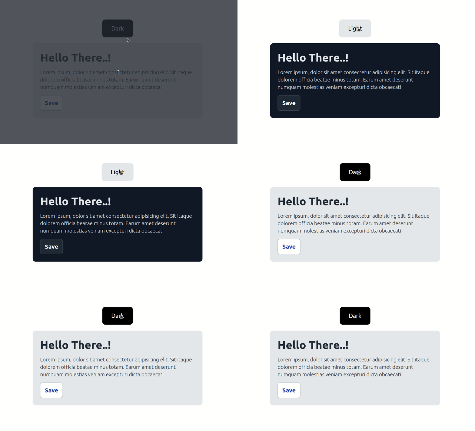
Dark mode is a user interface (UI) design option that displays content on a website or application with predominantly dark colors, typically black or dark gray, instead of light colors like white. Dark mode aims to reduce eye strain and improve readability in low-light environments or for users who prefer a darker interface.
To implement a dark theme in Tailwind CSS, you can follow these steps:
- The first user must set up tailwind CSS with react, next, or its preferred language.
For configure tailwind css with react js refer Installing Tailwind CSS in React blog.
For configure tailwind css with next js refer Optimizing Development Workflow: Setting Up Tailwind CSS and Next.js blog.
- After make one card component.
import React from "react";
function Card() {
  return (
    <div className="h-5/12 w-5/12 bg-gray-200 dark:bg-gray-900 p-5 rounded-lg mt-4 text-white">
      <h1 className="text-gray-800 dark:text-gray-200 font-extrabold text-3xl">
        Hello Dark Mode 👋
      </h1>
      <p className="text-gray-800 dark:text-gray-200 font-light mt-3 text-sm">
        Lorem ipsum, dolor sit amet consectetur adipisicing elit. Sit itaque
        dolorem officia beatae minus totam. Earum amet deserunt numquam
        molestias veniam excepturi dicta obcaecati
      </p>
      <button className="bg-white dark:bg-gray-800 py-2 px-3 font-bold text-blue-800 dark:text-white mt-3 rounded-md border border-gray-400 dark:border-gray-600">
        Button
      </button>
    </div>
  );
}
export default Card;
- Import card component into App component.
import { useState } from "react";
import Card from "./Card";

const App = () => {
  const [darkMode, setDarkMode] = useState(false);

  return (
    <>
      <div
        className={` w-full flex items-center justify-center flex-col ${
          darkMode && "dark"
        }`}
      >
        <input type="checkbox" onClick={() => setDarkMode(!darkMode)} />
        <!--Import all component -->
        <Card />
      </div>
    </>
  );
};

export default App;
- Your app should now be running with a button for the dark mode. Clicking on the button will chnage mode between the light and dark themes.
Make sure to style your components with the appropriate Tailwind CSS classes and utilize the dark class where necessary to apply the dark theme styles.
Modify tailwind.config.js
module.exports = {
  content: ["./src/**/*.{html,js}"],
  darkMode: "class",

  theme: {
    extend: {},
  },

  plugins: [],
};
- Start the development server: Run the following command in your project directory:
npm start or yarn dev
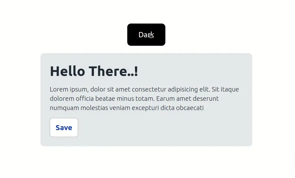
And That's it your preview in localhost:3000 is ready and looks like below image

Implementing a dark theme in your application using Tailwind CSS can significantly improve the user experience and make your application more accessible. By following this guide, you can easily add a dark theme to your project and provide users with the option to switch between light and dark mode. You can also customize the dark theme to match your application's design and improve its overall aesthetic.
